"The Project
This scheme, designed by Burrell Foley Fischer, involved the creation of a two-screen cinema in the city centre of Exeter by adapting and extending a former 1930's bus garage that had been in use as a furniture warehouse.
The Site
The site of the cinema is on Bartholomew Street West, just inside the line of the Roman and Medieval wall of the city of Exeter. Its immediate neighbours include 1970s flats, a Victorian terrace of houses and modern sheltered housing but within a very slightly wider context lie good 18th and 19th century houses, a fine late Georgian chapel and a public open space. Not only is the site prominent by virtue of being on a ridge, it is also within an area that has been developed continuously from Roman times, where recent architecture shows some of the draw-backs of adopting a 'fitting in' approach, drawing attention to itself by its poverty of detailing rather than blending unobtrusively into the historic fabric.
The Problems
The problems involved finding an open and welcoming form for a building containing two blind boxes. The building needed to create a suitable presence on the corner of Bartholomew Street and Fore Street. It needed to accommodate the slope up from the front to the rear of the site. In terms of architectural expression, the building needed to find a language which embodied the client's aspiration for stylish modern architecture without disrupting the historic setting. Where different kinds of planning consideration were concerned, it was also necessary to assuage the worries of neighbouring residents about the possible noise nuisance. The physical constraints of adapting the building that already stood on the site also had to be coped with.
The Solutions
The architects decided to use the existing building to house the two cinemas called for by the brief, one seating about 170 people and one seating just over 200. They sit back to back with a shared projection room at first floor level.
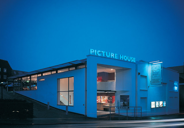
To the south west of the cinema halls, the extension houses the foyer, lavatories, bar/restaurant and gallery space. The main entrance on Bartholomew Street gives access to a two-storey space, with a staircase leading up to the gallery and bar space clearly visible on the first floor. This can also be entered directly from a door at the back of the building, where the car park is situated. This gives a suitable sense of presence and drama to arrival at the cinema, within what is quite a modest extension to the original building. The entrances at two levels mean that disabled people can reach all parts of the building without special arrangements being needed.
In townscape terms, these spaces are made visible externally by large areas of glazing within a simple white-rendered form. The main entrance, which is slightly recessed from the line of the building, has the appearance of a proscenium arch over a stage and is topped by the name of the cinema in neon lights. This gives a particularly welcoming impression at night, when the cinema is at its busiest.
The long western elevation of the building, diminishing in height towards the back of the site, has windows which reveal the activities going on behind them and relate in size to the scale of those spaces and activities. A glazed slit from top to bottom of this wall adds to the impression of the main entrance as a proscenium arch.
This combination of modest theatrical gestures and straightforward simple details means that the cinema has a strong presence which is suitable to its function without intruding aggressively into its surroundings.
The design was considered in some quarters to be too modern in style, but careful negotiations with the planning authority led to approval and also resolved the concerns of the neighbours about potential nuisance. There have been no problems or complaints about noise since the cinema opened.
The Lessons
The commercial success of the cinema since it opened has vindicated the cinema operator's belief in the contribution which architecture can make to commercial success. In the words of Lyn Goleby of City Screen 'The bricks and mortar are as important as the celluloid'.
Architecturally, the cinema demonstrates that it is possible to be theatrical and modern and restrained all at the same time. It illustrates that a difficult site can provide the solutions to design problems if it is approached imaginatively. It also shows that a use which is initially seen as threatening can come to be regarded as a socially highly desirable facility."
blog.jpg)

